Date:
01/02/2019
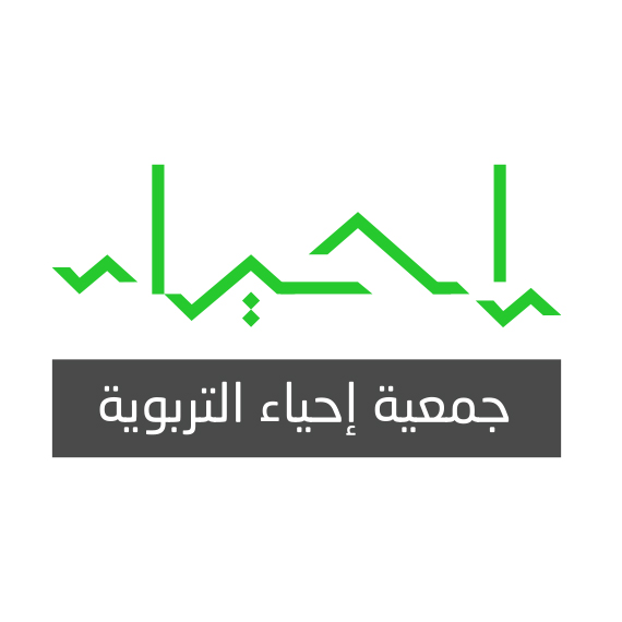
Client :Ehya Organization

the inspiration
Ehya “إحياء” is an Arabic word meaning “revival”.
Both the shape of the Kaaba as well as the colours were analyzed.

the execution
The logo is a typographic treatment of the Arabic word “Ehya” done to look like a heartbeat monitor.
bright green was also chosen to emphasize the visual of a heartbeat monitor.